Hôtel du Timbre 10.2022
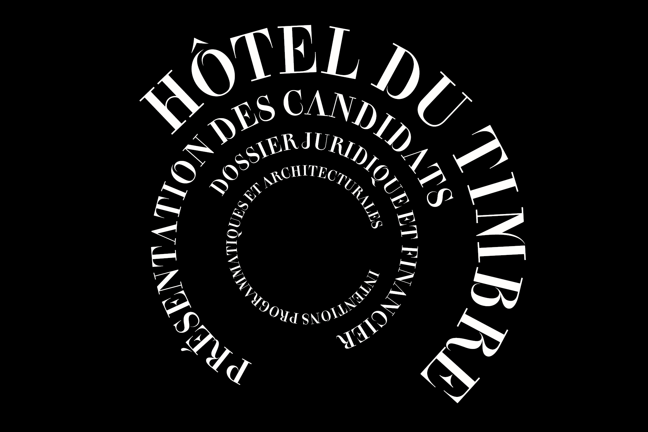
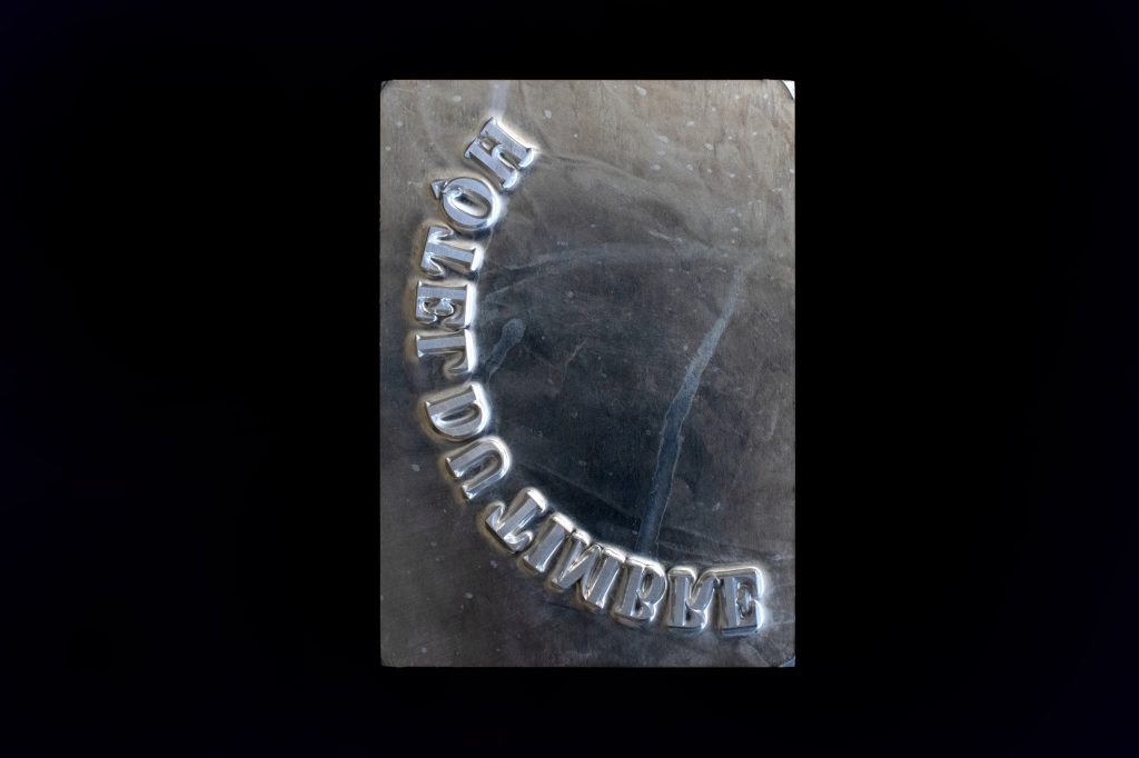
En — Typography developed for the identity of an application file for a state session of a historical building. It is the Hotel du Timbre in Paris.
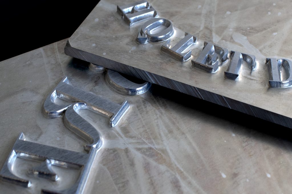
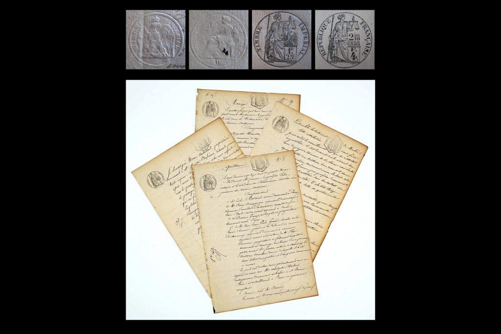
I decided to work with the Didot font as a starting point. This one is contemporary to the neo-classical architecture of the Hotel du Timbre. Modern” typefaces such as Didot or Bodoni emerged in the 19th century. The creation of this typeface is due to the apogee of the Empire where the social changes require a more evolved, stricter typography.
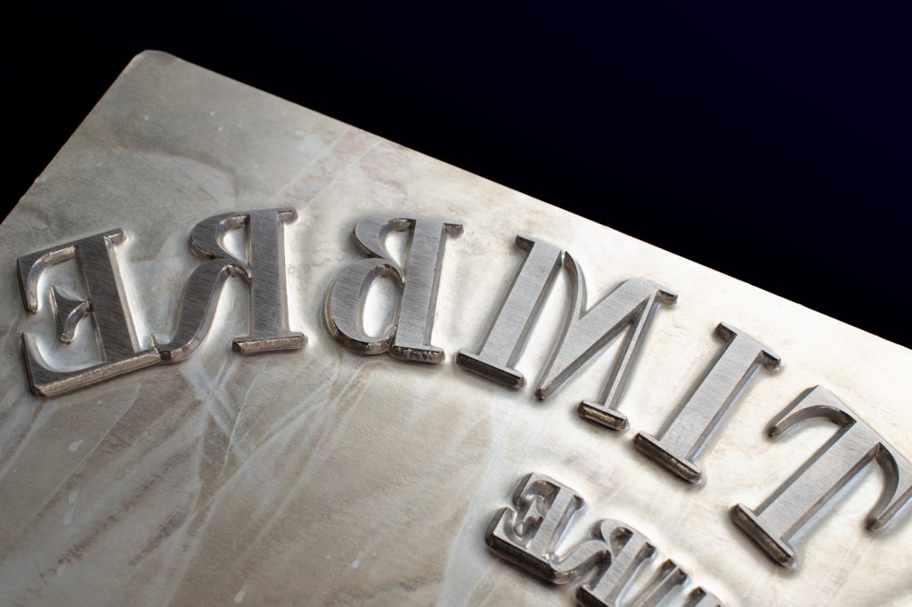
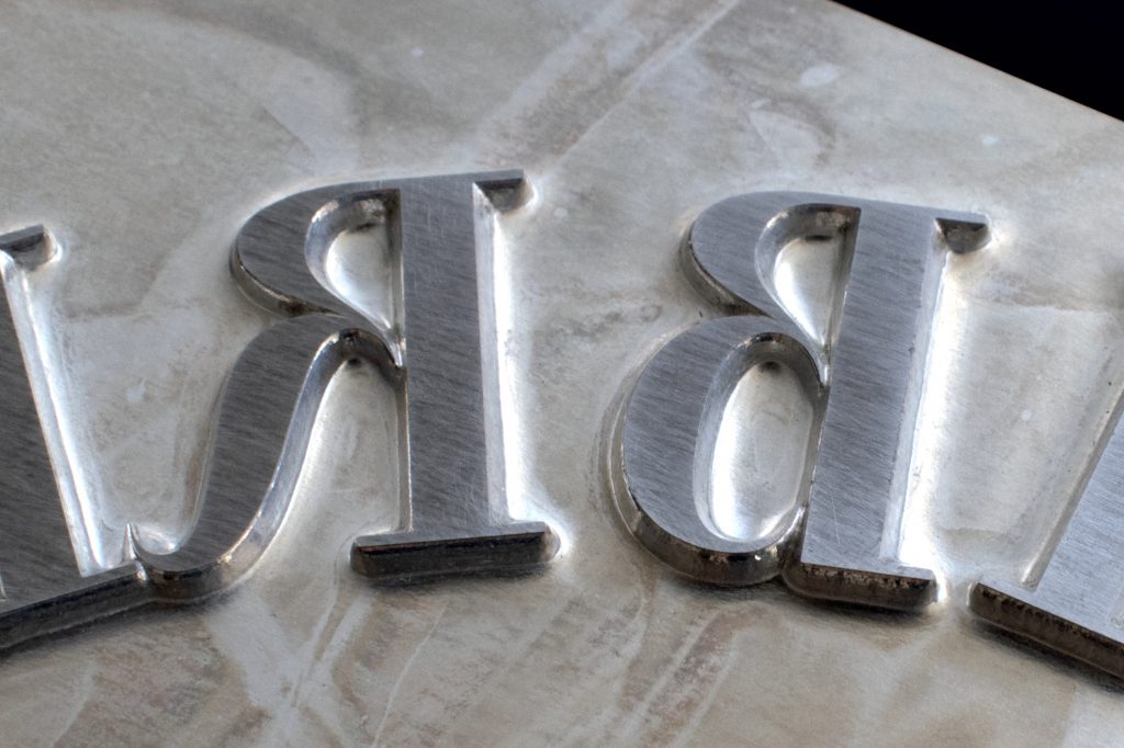
The evolution of printing techniques, the appearance of Vellum paper, as well as the mastery of lead typography, greatly facilitated this new reform in type design.
Modern typefaces evoke the typography of the beginning of the 19th century by their purified forms. They appear to be the result of the rationalization process begun in the classical era.
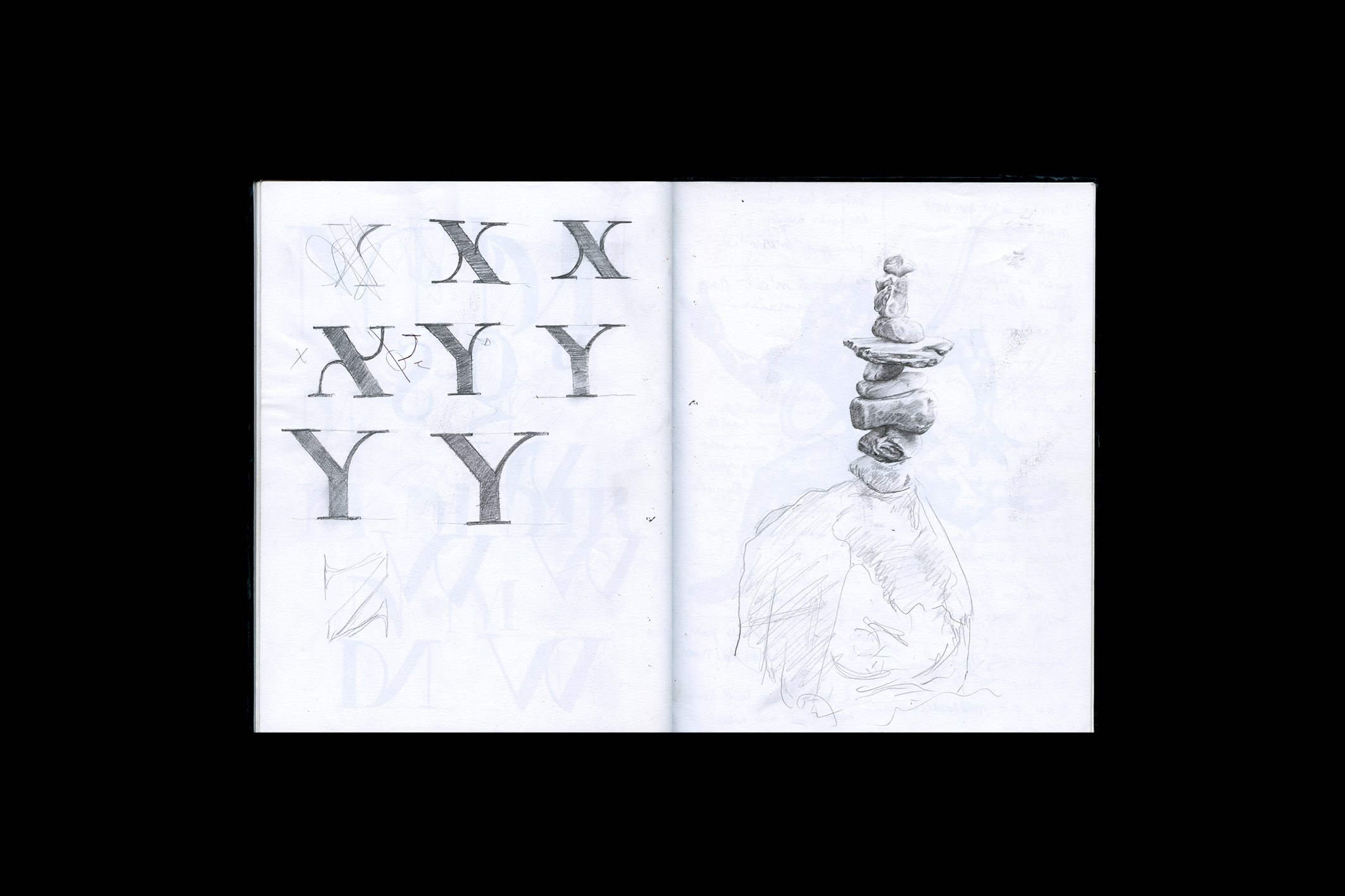
In order to echo the proposed architectural project I added more fluidity and openings to the typefaces while keeping the initial solid structure of the Didot.
Project in which I had the pleasure to work with Alice Cabaret founder of The Street Society.

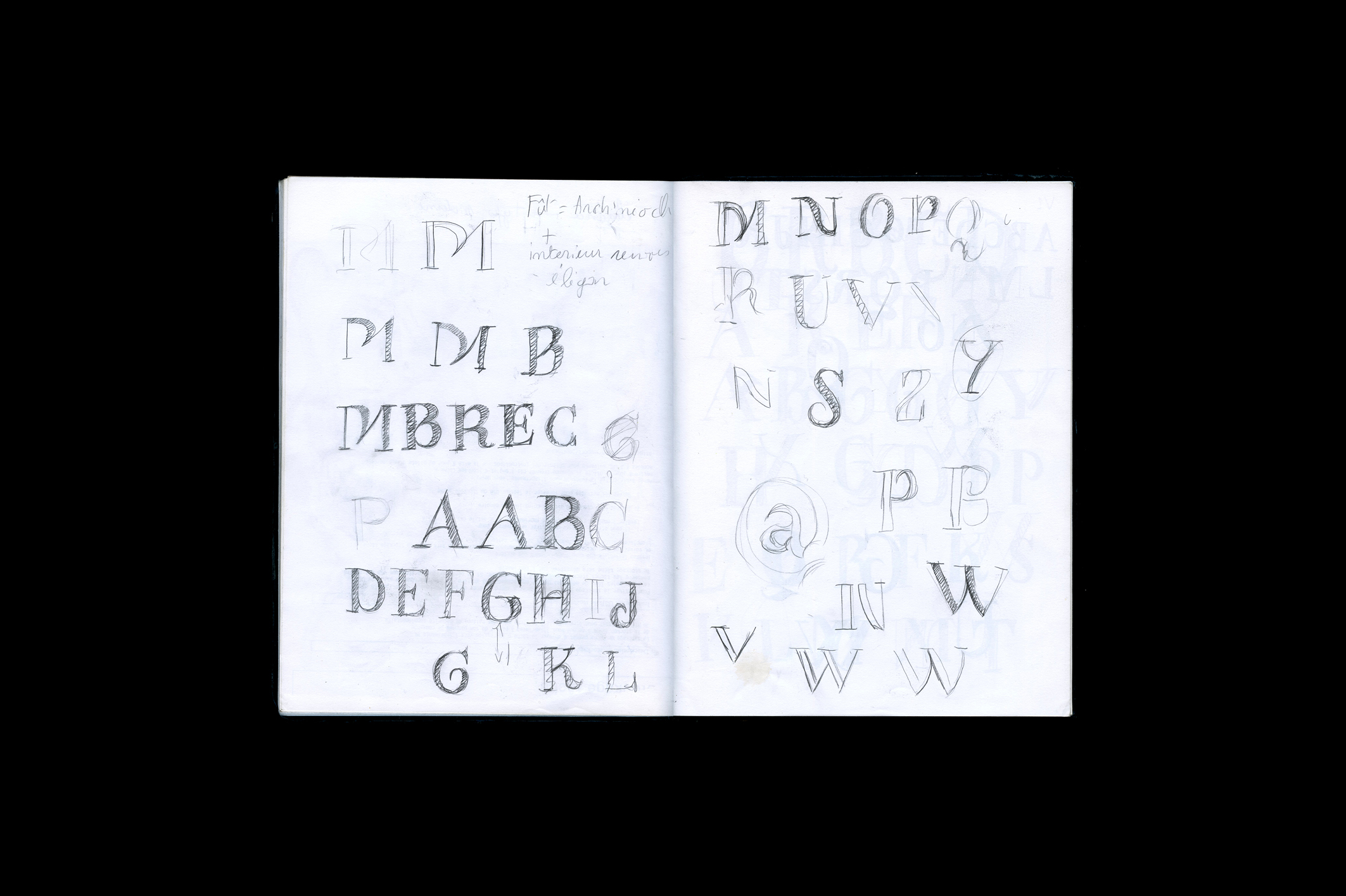
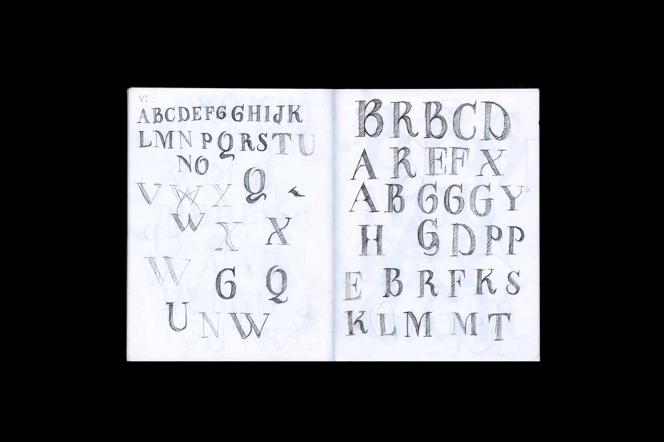
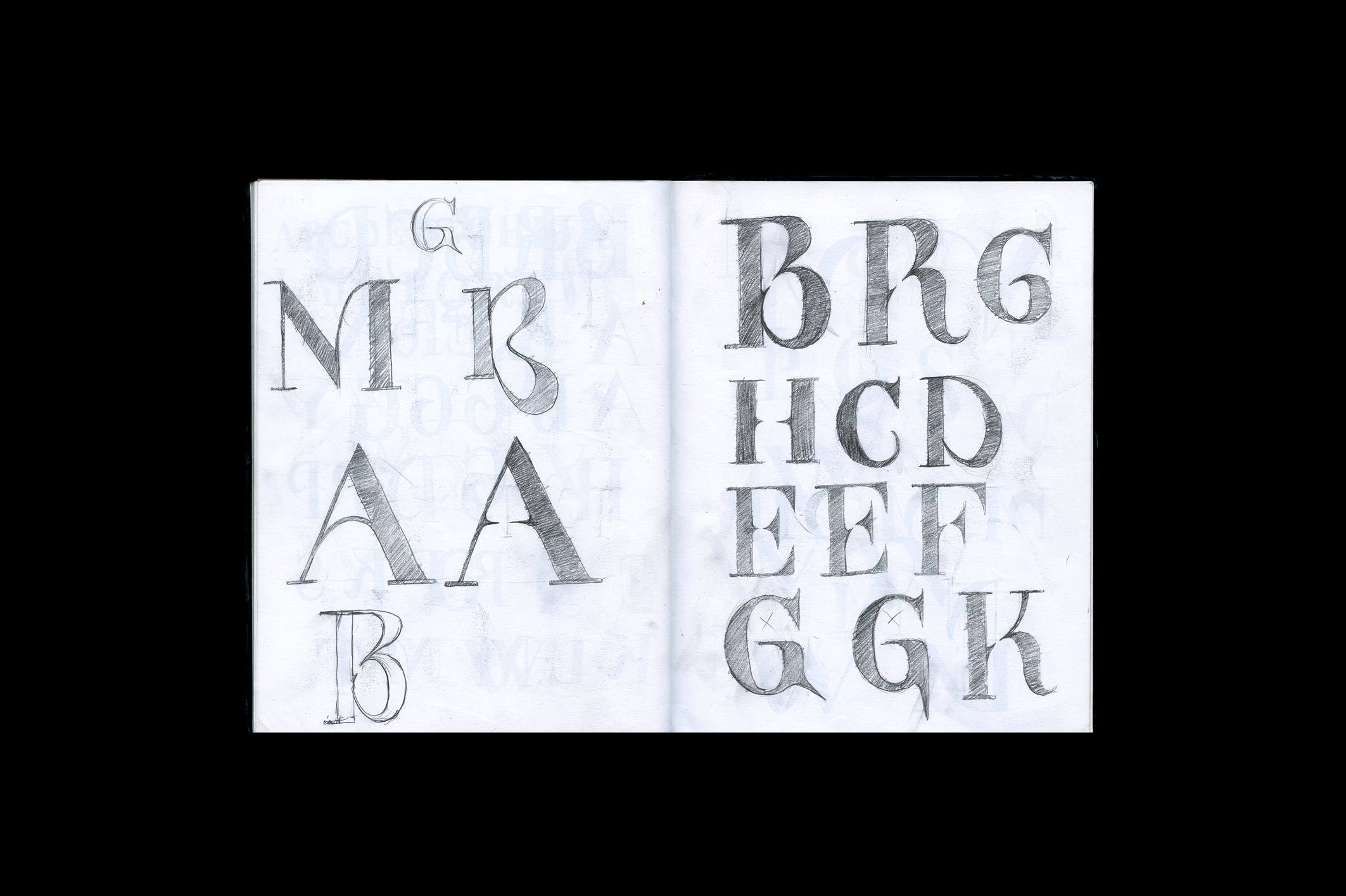
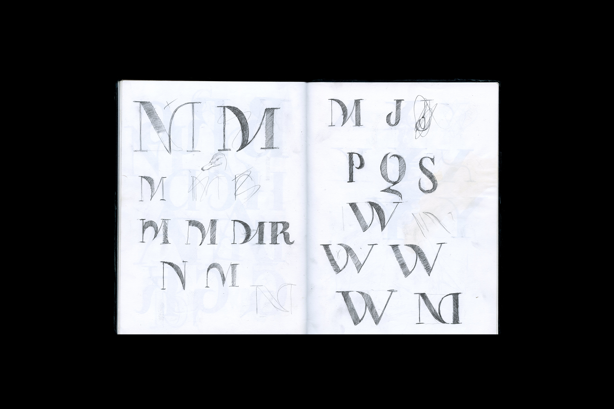
My sketches
